Business Intelligence
What Is a Business Intelligence Dashboard? Types, Examples, and How It Works
A business intelligence dashboard is a visual interface that brings important business metrics and key performance indicators into one place. It uses elements such as charts, tables, scorecards, maps, and filters to help people monitor performance, compare results, and identify issues that need attention.
The dashboard is only the visible part of the system. Its accuracy and usefulness depend on the data sources, definitions, validation rules, and update process behind it.
A well-designed dashboard should help its users answer three questions:
- What is happening?
- Where should I investigate?
- What decision or action should follow?
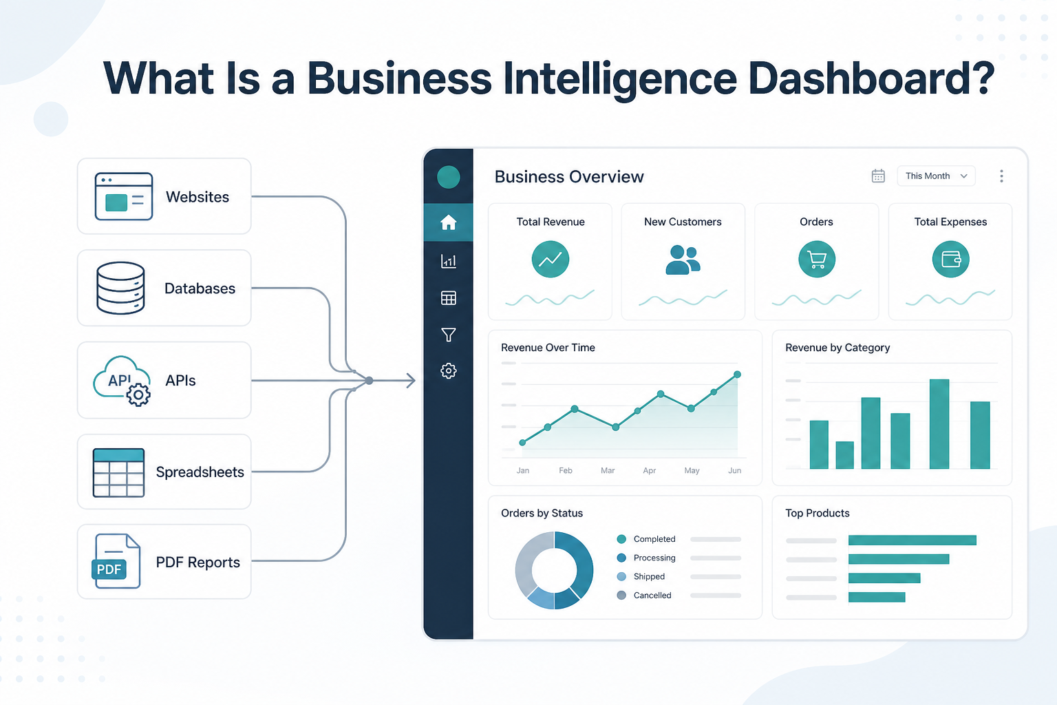
What Is a Business Intelligence Dashboard?
A business intelligence dashboard, also called a BI dashboard, is a screen or interface that displays selected business data in a visual format.
It can present information such as:
- Revenue and sales performance
- Costs and profit margins
- Inventory availability
- Marketing results
- Customer behavior
- Operational delays
- Competitor prices
- Product assortment changes
- Financial indicators
- Market trends
Tableau describes a BI dashboard as an information-management and data-visualization solution that can combine charts, graphs, reports, filters, and interactive actions in one screen. Qlik similarly defines a BI dashboard as a tool for tracking, analyzing, and reporting on KPIs and other business metrics.
A business intelligence dashboard organizes selected metrics around a specific decision, responsibility, or business objective.
A dashboard is not simply a collection of attractive charts. It should present the information a particular user needs, with enough context to understand whether performance is improving, declining, or moving outside an acceptable range.
What Does a BI Dashboard Do?
A BI dashboard converts prepared business data into a format that is easier to inspect and use.
For example, an ecommerce manager may use a dashboard to answer:
- Which products are unavailable?
- Which competitors changed their prices?
- Where has product coverage decreased?
- Which promotions were added or removed?
- Which products require pricing review?
A sales manager may use one to answer:
- Is the team meeting its target?
- Which territories are underperforming?
- How much qualified pipeline is available?
- Which opportunities have stopped progressing?
- How long does it take to close a sale?
An operations manager may need to know:
- Where are processing delays increasing?
- Which locations have the highest exception rates?
- Which suppliers missed expected delivery dates?
- Which tasks require immediate attention?
The dashboard helps by bringing the relevant measures together. It does not decide what those measures should mean or guarantee that the underlying data is correct.
How Does a Business Intelligence Dashboard Work?
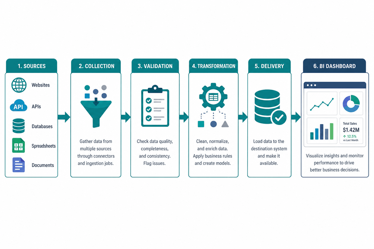
A dashboard usually sits at the end of a larger data workflow:
Data sources → collection → validation → transformation → storage or delivery → BI platform → dashboard
Each stage affects the final output.
1. Data is collected from relevant sources
Dashboard data may come from:
- Business databases
- CRM systems
- ERP platforms
- Accounting software
- Spreadsheets
- Data warehouses
- Internal APIs
- Public APIs
- Websites
- Online marketplaces
- PDFs and reports
- Client-authorized systems
Business intelligence includes more than visualization. Tableau describes BI as a broad set of processes and tools that can include data preparation, querying, reporting, benchmarking, mining, and visualization. Some dashboard projects use only internal company data. Others combine internal information with external market, pricing, property, travel, competitor, or financial data.
2. Data is cleaned and standardized
Data from different sources rarely follows one consistent structure. Common issues include:
- Duplicate records
- Missing values
- Inconsistent date formats
- Different currencies
- Conflicting category names
- Mismatched product identifiers
- Incorrect field types
- Stale records
- Changed source structures
- Inconsistent availability labels
Suppose one marketplace describes a product as Wireless Headphones Black and another as Black Bluetooth Over-Ear Headset. A dashboard cannot safely compare those records until the business has established whether they represent the same product. That may require identifiers such as SKU, UPC, EAN, model number, brand, size, or variant.
3. Business metrics are calculated
Raw fields are converted into measures that support decisions. Examples include revenue growth, average order value, conversion rate, price difference, product availability rate, gross margin, inventory turnover, average resolution time, customer retention, and budget variance.
Every important metric should have a documented definition. For example, “active customer” could mean a customer who purchased during the last 30 days, a customer with a current subscription, a customer who has not canceled, or a customer who logged in during the reporting period. If different teams use different definitions, the dashboard can create disagreement instead of clarity.
4. Prepared data is stored or delivered
Once records have been validated and transformed, they may be sent to a database, data warehouse, spreadsheet, secure file location, API endpoint, reporting platform, BI tool, or internal application.
Nenodata states that its custom data pipelines can feed databases, data warehouses, and BI tools, with delivery based on an agreed schedule and format. Project-specific destinations, integrations, and refresh frequencies should be confirmed during scoping.
Explore custom data pipelines.
5. The BI platform displays the information
The BI platform turns prepared data into visual components such as KPI cards, line charts, bar charts, tables, maps, funnel charts, scatter plots, heat maps, variance indicators, and detailed drill-down views.
Microsoft describes Power BI as a business analytics platform for connecting, visualizing, and sharing data. Its documentation defines a Power BI dashboard more specifically as a single-page canvas containing selected visualizations. The exact meaning of “dashboard” therefore varies between platforms.
Main Components of a BI Dashboard
Although dashboards vary by audience and purpose, useful BI dashboards usually contain several core components.
Key performance indicators
A KPI is a measure connected to an important business objective. Not every available metric should become a KPI. A KPI should help its user judge progress, risk, or performance.
Data visualizations
Choose the chart based on the question:
- Use a line chart for changes over time.
- Use a bar chart to compare categories or regions.
- Use a map when location affects the decision.
- Use a table when exact values or individual records matter.
- Use a KPI card for a small number of high-priority measures.
- Use a scatter plot to examine relationships between two measures.
Power BI documentation describes visualizations as the building blocks of reports that transform curated data and calculations into visual representations. A chart should not be included merely because it looks sophisticated.
Filters and interactive controls
Filters allow users to narrow the displayed information by dimensions such as date, product, region, marketplace, category, customer segment, location, account manager, or sales channel. Available interactions depend on the platform and content type. Microsoft distinguishes Power BI dashboards from multi-page reports and notes that they provide different exploration and filtering capabilities.
Comparisons and context
A number without context is difficult to interpret. A dashboard should show useful comparisons such as current versus previous period, actual versus target, current price versus competitor price, current availability versus historical availability, regional versus company-wide results, or current value versus an agreed threshold.
A card displaying “Revenue: $750,000” does not tell the user whether revenue is growing, declining, or meeting expectations.
Data freshness and status
Users should be able to see when the data was last updated, which period is being displayed, which time zone applies, whether all sources completed successfully, whether any records are incomplete, and whether a source or pipeline failed. A recent dashboard timestamp does not necessarily mean that every underlying source refreshed successfully.
Types of Business Intelligence Dashboards
Dashboard categories are not universal, but four common types are useful when planning a BI project.
Strategic dashboards
Strategic dashboards help senior leaders monitor progress toward longer-term business goals. They may include revenue growth, profitability, market expansion, customer retention, business-unit performance, and progress against annual targets. These dashboards usually contain a limited number of high-level measures.
Operational dashboards
Operational dashboards help teams monitor ongoing activities and exceptions such as order-processing status, inventory availability, delivery delays, support queues, marketplace prices, website performance, and product availability changes. They may require frequent updates when teams need to act quickly.
Analytical dashboards
Analytical dashboards support investigation rather than simple monitoring. They may include historical trends, category comparisons, customer segmentation, cohort analysis, drill-down views, geographic analysis, and record-level exploration.
Executive dashboards
Executive dashboards summarize the measures most relevant to senior decision-makers and may combine financial performance, sales results, customer indicators, market conditions, operational risks, and strategic objectives. An executive dashboard is defined primarily by its audience and purpose, not by a specific chart type.
Business Intelligence Dashboard Examples
The best dashboard structure depends on the decision it is expected to support.
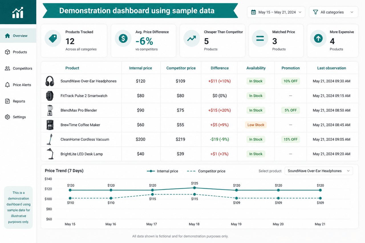
Ecommerce pricing dashboard
An ecommerce pricing dashboard may show internal product price, competitor price, price difference, promotion status, availability, seller information, price history, product-match status, and last successful observation.
The difficult part is often not drawing the charts. It is identifying comparable products and maintaining reliable observations across marketplaces whose listings, sellers, variants, or page structures may change. For related collection methods, see ecommerce price scraping.
Nenodata’s competitor price intelligence service says that sources, selected fields, available identifiers, and matching methodology are defined before collection. Potential outputs include competitor prices, promotions, availability, product coverage, and assortment-change signals, subject to scope and source feasibility.
Sales dashboard
A sales dashboard may include revenue by period, sales against target, qualified pipeline value, lead conversion rate, average sales cycle, revenue by territory, and performance by representative. The dashboard should distinguish between closed revenue, forecast revenue, and unqualified opportunities.
Financial research dashboard
A financial research dashboard may combine information from company reports, financial statements, public filings, market sources, APIs, business documents, and PDF reports. Nenodata describes its financial data extraction service as collecting, structuring, validating, and delivering financial information from public websites, reports, PDFs, filings, APIs, directories, and business documents for research, BI, monitoring, and internal tools.
Real estate dashboard
A real estate dashboard may track active listings, median asking price, price changes, listing status, days on market, rental availability, property type, and geographic distribution. Nenodata’s real estate data intelligence service converts public or permissioned listing, pricing, status, and market information into structured feeds for product, analytics, and operations teams. Available output formats listed on the page include CSV, JSON, API endpoints, and scheduled feeds.
Travel market dashboard
A travel dashboard might monitor hotel or route prices, availability, review scores, destination coverage, package changes, provider comparisons, and market-level trends. Nenodata’s travel data analytics consulting page describes collecting public travel-market information and structuring it for pricing, availability, review, reputation, and market-intelligence workflows based on agreed sources, markets, fields, refresh expectations, and delivery destinations.
BI Dashboard vs. Report
Dashboards and reports may use the same data, but they usually serve different purposes.
| BI dashboard | Business report |
|---|---|
| Provides a focused overview | Provides more detailed information |
| Emphasizes selected KPIs | May contain many measures and records |
| Supports recurring monitoring | Often analyzes a period or subject |
| Commonly uses visual summaries | May include tables, text, and explanations |
| Designed for quick review | Designed for deeper examination |
Tableau characterizes dashboards as high-level views of key metrics, while reports generally provide more detailed analysis of a defined topic. The exact distinction depends on the software. Use a dashboard when users need to monitor selected measures repeatedly. Use a report when they need detailed records, explanations, or extended analysis.
BI Dashboard vs. Data Visualization
A data visualization is one representation of data, such as a chart, map, or graph. A BI dashboard is an organized collection of metrics and visualizations designed around a business purpose.
A line chart showing monthly sales is a data visualization. A screen showing sales, targets, pipeline value, territory performance, and product performance is a sales dashboard. Adding more visualizations does not automatically improve a dashboard.
Benefits of a Business Intelligence Dashboard
A well-designed dashboard can help a team consolidate relevant information, monitor performance consistently, identify changes and exceptions, reduce repetitive reporting work, and support more focused discussions.
These benefits depend on implementation quality. A dashboard built on incomplete, stale, or poorly defined data may make decision-making more confusing rather than easier.
How Often Should a BI Dashboard Refresh?
There is no universal refresh frequency for every dashboard. Choose the schedule based on how often the source changes, how quickly users can respond, source-system limitations, collection cost and complexity, the importance of the decision, and the risk of using stale information.
Periodic updates may suit executive summaries, monthly financial performance, strategic planning, long-term market trends, and historical reporting. More frequent scheduled updates may suit competitor pricing, product availability, operational queues, travel availability, and time-sensitive market monitoring.
Faster delivery may be appropriate when the source supports it, the information changes rapidly, users can act immediately, the additional infrastructure is justified, and failure and latency conditions are understood. Do not use “real-time” as a general label for any frequently updated dashboard. A dashboard may contain several sources with different refresh schedules and delays. Precise delivery frequencies for a Nenodata project should be confirmed during scoping.
Why Dashboard Data Quality Matters
A dashboard can look accurate even when its data is not. A sudden decline in a chart could represent a real business change—or a source that stopped updating, a changed webpage structure, duplicate records, incorrect date handling, failed product matching, missing regional data, currency conversion errors, a changed metric definition, or partial API results.
Useful checks may include:
- Required-field validation
- Duplicate detection
- Record-count monitoring
- Date and time-zone validation
- Currency and unit normalization
- Identifier matching
- Freshness checks
- Outlier review
- Schema-change detection
- Delivery-status monitoring
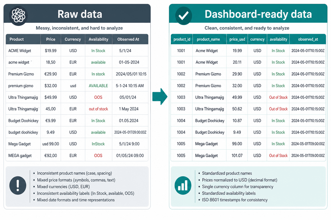
A Source-to-Dashboard Methodology
The following workflow can help teams plan a dashboard whose data comes from websites, documents, APIs, or multiple business systems.
Step 1: Define the decision
Start with the decision the user needs to make—for example, which products should be reviewed for repricing, which markets have declining availability, or which sales regions need attention. Do not begin by choosing chart types.
Step 2: Define the metrics
For each metric, document its business purpose, calculation method, source, time period, inclusion rules, exclusion rules, and responsible owner.
Step 3: Define the required sources and fields
Document target sources, required fields, markets or locations, products or entities, available identifiers, historical-data requirements, refresh expectations, and delivery destination.
Step 4: Test source feasibility
Before promising a dashboard output, determine whether the information is public, permissioned, or client-authorized; consistently available; technically collectable; suitable for the requested frequency; and detailed enough to support the metric.
Step 5: Collect and validate records
Test the output for missing values, duplicates, invalid formats, empty results, unexpected changes, failed documents or pages, out-of-range values, and inconsistent record counts.
Step 6: Normalize and match data
Standardize dates, time zones, currencies, units, categories, addresses, names, availability labels, and product or entity identifiers. Matching rules should be documented, especially when comparing products or listings from different sources.
Step 7: Deliver structured output
Depending on the approved workflow, prepared information may be delivered through CSV, JSON, API, database integration, data warehouse, scheduled feed, or BI-tool destination. Exact destinations should be confirmed for each project.
Step 8: Monitor pipeline health
A recurring dashboard workflow should make it possible to review last successful collection, source-level failures, record counts, missing-field rates, schema changes, delivery status, and data freshness. Confirm which monitoring checks are included by default and which require custom project scope.
How to Choose KPIs for a BI Dashboard
Choose KPIs based on the decisions users need to make, not simply on the fields that are easiest to obtain.
Define the objective, then the decision, then the supporting measures, then the threshold, then the action owner. Every exception should have a person or team responsible for reviewing it. A dashboard that continually identifies problems without an action process becomes passive reporting.
Common BI Dashboard Mistakes
Displaying too many metrics
A dashboard containing every available metric makes priority signals harder to identify. Begin with the measures needed for the primary decision.
Using unclear definitions
Document how each KPI is calculated. Include the period, data source, inclusion criteria, exclusions, and any assumptions.
Hiding data freshness
Show when the data was collected and whether every required source updated successfully.
Combining incompatible source data
Two sources may use different definitions, coverage, currencies, update times, or availability rules. Normalize these differences before combining the records.
Assuming frequent updates are always better
The appropriate frequency is the one that matches the decision and the user’s ability to respond.
Treating correlation as causation
A dashboard may show that two values moved together. It does not prove that one caused the other.
Designing before testing the data
Test source feasibility and sample output before finalizing the interface.
Ignoring failure states
A dashboard should not quietly continue showing old values when an upstream source or delivery process has failed.
Do You Need a BI Platform, a Data Pipeline, or Both?
You may mainly need a BI platform when:
- Your required data is already clean and accessible
- Existing connectors support your systems
- The primary problem is visualization and sharing
- Your metrics and definitions are established
- Your data refresh process already works
You may need a custom data pipeline when:
- Required information is spread across websites
- Important fields are contained in PDFs or documents
- A suitable API is unavailable
- Source records use inconsistent formats
- Products or entities must be matched
- Data must be validated before reporting
- Collection must run on a defined schedule
- Existing BI connectors do not support the source
You may need both when external or unstructured information must be collected, standardized, and delivered before a tool such as Power BI, Tableau, Qlik, or another reporting system can visualize it.
How Nenodata Supports Dashboard-Ready Data
Nenodata is not a replacement for a complete BI visualization platform.
Its more direct role is supporting the data layer behind analytics and reporting. Based on Nenodata’s published service information, relevant project workflows may include collecting data from approved websites, APIs, databases, or documents; structuring records into an agreed schema; validating extracted fields; normalizing data across sources; applying agreed matching methods; delivering structured data to databases, warehouses, or BI tools; running scheduled extraction workflows; and supporting external pricing, financial, property, travel, and market datasets.
Nenodata says it designs, deploys, and maintains custom extraction workflows that feed databases, data warehouses, or BI tools. Exact sources, fields, formats, refresh schedules, integrations, and monitoring requirements should be confirmed during project scoping. See Nenodata’s business data extraction services.
Need external data for a business intelligence dashboard?
Share your proposed sources, required fields, geographic coverage, output format, and refresh expectations. Nenodata can review source feasibility and define a structured sample based on the approved project scope.
Request a Data SampleQuestions to Answer Before Building a BI Dashboard
Before choosing a tool or finalizing the interface, answer these questions:
- Which decision should the dashboard support?
- Who will use it?
- Which KPIs matter?
- How is each KPI calculated?
- Which data sources are required?
- Is each source public, permissioned, or authorized?
- How often does each source change?
- How quickly can users act?
- Which records need to be matched?
- How will incomplete or failed updates be identified?
- Where will the prepared data be delivered?
- Who owns the dashboard and the data pipeline?
Clear answers reduce the risk of creating an attractive dashboard that users cannot trust or act upon.
Final Takeaway
A business intelligence dashboard displays selected metrics and KPIs in a visual interface so users can monitor performance, compare results, and identify changes that require attention.
The charts are only the final layer. Before information appears on a dashboard, it may need to be collected, validated, standardized, transformed, delivered, and monitored.
When the required information already exists in a clean and accessible system, a BI platform may be sufficient. When the data is distributed across websites, marketplaces, APIs, reports, documents, or inconsistent systems, a custom pipeline may be required before the dashboard can become useful.
Start with the decision the dashboard must support. Then confirm whether the required data can be supplied at the quality, detail, and frequency that decision requires.
Sources
- Microsoft Learn — Power BI dashboards, reports, and visualizations
- Tableau — Business intelligence and dashboard concepts
- Qlik — Business intelligence dashboard overview
- Nenodata — Data Extraction and Web Scraping Services
- Nenodata — Price Intelligence
- Nenodata — Financial Data Solutions
- Nenodata — Real Estate Data Intelligence
- Nenodata — Travel Data Analytics Consulting
Recheck vendor documentation URLs periodically. Nenodata is positioned as a dashboard-ready data and pipeline provider, not as a BI visualization platform.